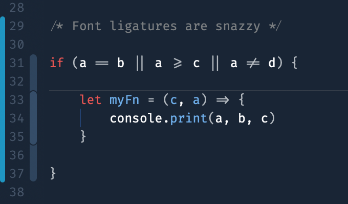
Using fonts with ligatures to improve readability
I set up a new dev laptop for myself over the Christmas holidays. I took the opportunity to burn down my old environment and to survey the 2021 tool landscape, which included testing out various terminals and setups, editors, and fonts. This year I discovered Fira Code, a tidy little monospace font that supports ligatures.
Ligatures are two or more letters (or graphemes) that can be combined to make a single glyph. The result of combining letters into these ligatures can make complex syntax a bit easier to read, especially if you are familiar with the notations the concepts are based on.

Fira Code has installation instructions for most platforms, though be aware that most editors have additional requirements to enable the automatic display of ligatures.