How we write headlines is changing
I find trends in style guidelines interesting, especially when shared style guides lag language usage in the wild. I have observed a shift in headline style from Title Case to Sentence case in the majority of commercial publications online. I've also found a general improvement in clarity from the most reliable publishers, mostly due to well understood in house style guidelines.
Common headline formats
There are for general formats used for headlines today, with some publications using multiple methods depending on the feed source.
- “Sentence case” is used in most established online publications in 2022.
- “Title Case” Lags in Usage
- “Start Case,” Or Tabloid Case, Also Lags In Usage
- “ALL CAPS,” THANKFULLY ALSO LAGS IN USAGE”
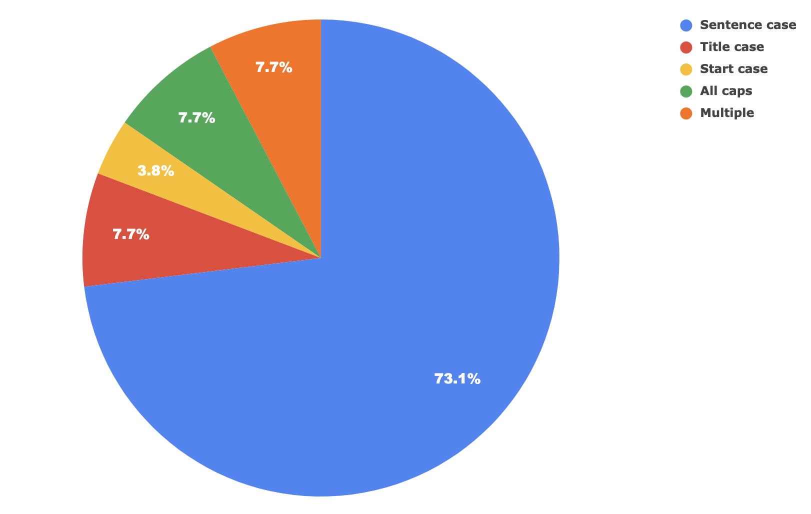
Chart tracking top 25 publications in US, Canada, and the UK.
Surprisingly, a small number of top publications use multiple formats for headlines. This is likely due to differing requirements by different news engines and stylistic choices between different levels of design hierarchy.
Other types of letter case were not in use in any of the sampled publications.
Does letter case even matter?
The way that text is formatted changes how we read it, even if subtly. It hints at what is important, what isn't, and the way the words play back in our brains. It can speed up or slow down our comprehension, and even give a phrase a sense of style.
For example: I read different types of headlines in my head using different voices, which for me hint at an increasing level of ridiculousness:
- Sentence case: a conversational summary, the way that a Dan Rather might preface a story with.
- Title Case: starts to sound like a 1950s radio or film announcer reading a headline. I imagine J. K. Simmons (from Spiderman) reading these, or the more classic David Kaye (from Disney's UP) reading as a Newsreel announcer. This one feels fun.
- Start Case: progresses towards a 1950s newsie hawking daily papers on the street corner.
- ALL CAPS: is the full-on satirical version of 3 that is loud and abrasive, unless the font size is toned down.
There are legitimate uses for each style, from portraying a serious tone, to adding emphasis, and then towards the less serious satirical style used by many tabloids. The texture of how we break down headlines is affected by the case, punctuation, and language too. These are interesting design tradeoffs we can consider when defining a brand or publication style.
Deviation from the AP and other traditional guides
There is a difference between the more traditional style guides and what we're seeing online in 2022. The divide trends towards more clarity and less hyperbole to reinforce trust in a a publication. I suspect that at least part of the motivation is that Sentence case is simpler to write in an online world, requiring significantly less training and editorial time. I also believe that, generally, Sentence case is easier to scan quickly.
It's important to remember that there are many language style guides (at the time of writing, this list is missing the CP guide). Guidelines help define a voice for various types of publications, and those differing voices are important.
The Associated Press continues to recommend the long running standard Title Case for headlines:
In AP style, headlines capitalize the first word, proper names, or proper abbreviations, verbs, pronouns, adjectives, and adverbs. (source)
The Chicago Manual of Style also continues to recommend a variant of Title Case (though their standard is behind a paywall).
Canadian and British styles differ from the classic US styles, mostly focusing on Sentence case (in both the CP and OED), which explains my strong bias towards it. The muted style reads evenly, and the gradients of choppiness in the more capitalized formats starts to feel less balanced as it graduates to ALL CAPS.
I find that switching case mid-thought delays how we parse phrases as we read. That flow is important to how we perceive meaning. Letter case, combined with language and punctuation affects how we perceive the summary intent of a headline. Balancing these carefully and intentionally is an important part of any brand or publication feel.
Headlines are the tip of the iceberg
As you dive into the various style guides, the devil is certainly in the details. A cheatsheet for the Canadian Press Stylebook lists various correct and incorrect word usages, spellings, and letter case. Each style guideline has a long list of exceptions and special cases, and editors spend many years becoming intimately familiar with their brand's feel and flair.
I find the rules around human language fascinating. We're transporting thoughts between humans with varying efficiency and purpose. We have the ability to play with the various toggles and levers to accomplish this teleportation of thought. It's absolutely magical ✨.