Thinking in diagrams; a developers guide to learning to love drawing design
I find that software developers struggle to sketch diagrams of their software. They get lost in the specifics of diagraming techniques, in choosing from the many available tools, or in the futility of drawing diagrams at all. I understand their pain, as there are many standards for diagrams and many (often obtuse) tools for drawing with. It's not very motivating to have a sea of choices, none of which looks particularly appealing.
I think about software design by diagramming and writing. The act itself improves the result. It forces me to decompose and organize the problem, and attempt to explain it back to myself. I have always been able to think about software through this process of sketching, refining, and describing diagrams, even when I didn't know anything about what was standard or what should be done. I started by doing what made sense to me.
Over the years, I found that people's milage varied with my diagrams and documentation. Sometimes a diagram would communicate clearly and other times it would baffle. I took the time to figure what I didn't know, reading and trying pretty much everything I could get my hands on. And oddly enough, many of my earliest diagrams were the most useful, before I started to adopt the more specific technical styles. Why was that?
There are many paths, many shoes, and many feet
There are as many diagraming standards as there are development languages. There is a common subset that is much more manageable, but it's still easy to get lost in the choices if you don't have an understanding of what the history and classifications are. It's easy to be fooled too, as even an obtuse way of drawing will start to make sense to you if you practice it often enough.
One of my early mistakes was using diagrams that didn't suite the audience, the problem, the level of detail, or even my way of thinking. A great example was when UML became popular. I drew all sorts of architecture and design diagrams using its parts, and for my own thinking it was fairly productive. But I found that these diagrams communicated poorly, as they captured the wrong level of detail for many types of conversations. They also missed other details that are important in higher level thinking about a system. It wasn't just a problem with UML, I was applying it poorly too.
It turned out I was focusing on the trees before the forest. Much of UML is, for example, great for showing the precise details of things. These detailed schematics don't always show the hierarchical or proportional relationships well, but in terms of the finer aspects of design they are great. But try to use a class diagram to explain how a larger system functions and you'll be losing out on all sorts of important hints and cues.
Now if you're detailing the design of a class library, or the interactions of a protocol, then many of the UML diagram types are great. If you're discussing features and architecture, you'll be missing important parts of your story. You need to understand what you're trying to capture and communicate before picking a style of diagram.
Designing chopsticks, a completely trivial example
Let's take a simple problem of design: how do chopsticks work? We can imagine them as a mechanical problem, as a software service problem, or as a manufacturing problem.

Consider the humble utensil: chopsticks. Two pieces of bamboo, plastic, or steel. Tapered. Textured. Packaged. Done.
If we were defining how to build chopsticks, we might describe what they were made of; their length, their properties, or their use. If we were coding up a chopstick abstraction for our latest game, we might draw their properties, or relationship to other utensils, or their data storage. If we were selling a web service that provided RESTful chopsticks, we might show their architecture or APIs. If we were Apple, we might describe the detailed manufacturing process that makes them what they are.
Which style of diagram would help you come up with a design for some choice chopsticks? Which would help you build them as a web service? Which would help you explain their purpose to your customers?
Feature diagrams
We could define chopsticks in terms of their utility:
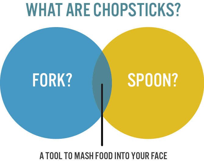
Of course this is a Venn diagram, a joke (and a bad one at that). Feature diagrams are often nonsensical, as they show features in boxes and circles. They're meaningful in terms of showing features and their relationships, but are certainly not something you could build software from.
Feature diagrams are useful, however, especially to users who want to understand your product. Finding a visual language for the people who use your software is important, as it can simplify your documentation and support. It lays a foundation of icons, flow, and terminology. Users think about what they need from the software and what they create with it. Helping them think in the language of your software can make it easier for them to become productive with it. This is good.
Composition diagrams
Or, we could define the constituent components of chopsticks:
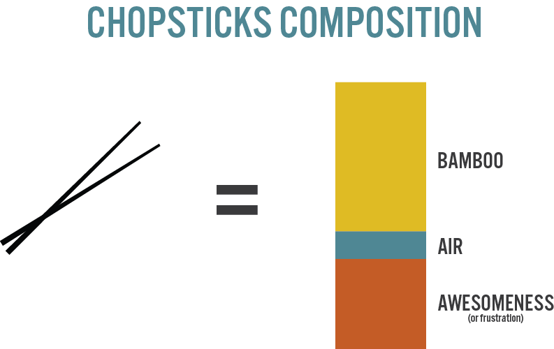
These are great diagrams for understanding the gravity of features or components. It could just as easily represent the types of languages or services used, or the number of types of data in the system, or the composition of the user base.
Functional diagrams
Or we could define how chopsticks work mechanically:
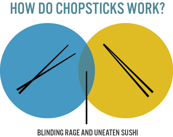
I use mechanical style drawings for thinking through states, sequences and componentization. This diagram, of course, is a silly summary of states in Venn form.
Functional diagrams allow you to use space and size to define how components relate. Lines and arrows can show flow, and containment can show composition. These mechanical drawings have standard forms in UML and various architecture standards, so it's worth reading up on what's done elsewhere if working with teams familiar with specific diagramming standards. You're also free to forge your own way with these diagrams, though they will work better if you rely on at least a few familiar conventions.
For sketching, obviously, you can pick and choose what works best for you. This is mostly how I think in design. I love to draw software and interfaces in terms of machines and ad hoc drawings. The freeform style is fast, expressive, and fun. These are important attributes for thinking in.
Architecture diagrams
Now if we were building chopsticks as software, we could define their architecture:
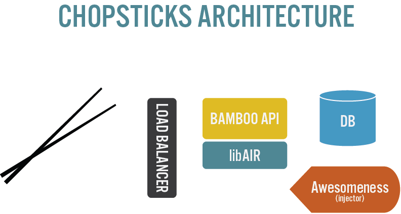
I love architecture diagrams. They represent the polished, high level thinking about a system. They look a lot like things you'd see in marketing materials, high level enough to be approachable, detailed enough to provide insight. You might not be able to build software directly from such diagrams, but they are great for giving people an overview of your software or service. They are especially useful when bringing on new staff at all levels, as well as showing clients, customers, and investors what you do. They provide a vocabulary for everyone to share, with a spacial sense, both visually and in terminology.
I find that architecture diagrams work best when they borrow concepts from lower level diagramming languages, but simplified and more iconic. This aids familiarity, and provides an expressive way to pack information into the limited format. It also is a way to lead people into your detailed designs, anchoring their understanding in the simpler overview.
I believe high level diagrams are the most important development artifact when they accurately represent your software and its ecosystem. They represent your core values in terms of a defined language, and they map your way through design and construction. Your teams and management run blind without this shared understanding.
API diagrams
We could also dive into more detail and define a pair of chopsticks as a web service API:
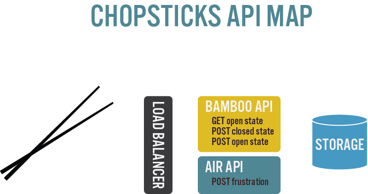
API diagrams are spacial maps of your web service components and their namespaces. They are a lower-level slice of functionality specific to the web, but similar to component diagrams. These diagrams extend the vocabulary of your software, and decompose it into spheres of influence, and layers of implementation.
I also love API diagrams, as they help me think about what goes where, and about the actions and data. Thinking about decomposition is helpful for finding holes in your understanding and for finding organization before you build out the system (or when adding to it).
There are many standard diagram styles for component diagrams, depending on your audience and specific purpose.
Lower level diagrams
As we continue to describe each part of a system, we find our way to lower level diagrams. These include things like:
- schema diagrams (ERD, for example)
- component and library diagrams
- class diagrams
We also start to wonder about how these pieces interact, for which we use lower level sequence, state, and transition diagrams. Tables are also useful for states and transitions, and I have found no single approach useful for all types of detailed planning.
And everything else
When considering interactions we use wireframes, information hierarchies, sites maps, user interface mockups, and so on. These diagrams are just as important, and should also share pieces of your visual design language.
My path through the forest
I have applied many types of diagrams to various stages of the design and development process. Some have worked and others have not. Part of my learning had me figuring out what worked for my own exploratory thinking and part of it had to do with finding out how to improve what other people understood of my designs. Some of the challenge was in the type of diagram used, some of it in the level of detail, and some of it in the style applied to the drawings themselves.
If you look at my simplified examples you'll see a few common themes:
- a shared and expanded terminology,
- a shared and expanded set of shapes,
- a shared and expanded set of colours
I tend to vary the colours and shapes in my design diagrams, though there are common themes. For example, I tend to use icons from standard diagramming languages in higher level diagrams. I also tend to pick fonts and colours that suit the domain or product branding, to bolster familiarity and ownership of such things. I also pack in a bit of humour, where appropriate, to keep people alert and enjoying themselves.
I find that these elements translate nicely to pencil sketches and whiteboard discussions too. If you start to work on a language for your software, your entire team will gain from the tools you have provided for them. They will be able to leverage existing definitions and extend them with their own design details.
But making diagrams is difficult
Navigating through the universe of diagramming techniques and ways of applying them is in itself a huge undertaking. Add to that the difficulty in recording and producing attractive diagrams and you have a task that seems impossible.
I'll let you in on a secret. It's really very simple. You just draw. Keep drawing, enjoy it, learn your tools, read a bit, and before you know it you'll be thinking visually.
So how do I produce diagrams? Is there a magic tool that will save us all?
I learned dozens of tools before I realized there was no perfect tool. Today I still use a variety of tools to translate what I see in my head to paper (and I, of course, also use paper).
At first learning multiple tools seemed counterintuitive. It felt like a waste of time. I mean, why learn several tools when I could learn one really well? It turned out that learning various tools taught me the fundamentals of drawing in a way that makes it simpler to use any drawing tool. It gives me choice, dexterity, and a richer palette to work from.
The principles of making technical drawings are simple, once you realize there is no magic. You just do it. You work around the limitations. You nudge things by hand. You use what the tool does well and ignore what it doesn't. For me, I would get frustrated with a tool and quit, when I really should have been frustrated at my lack of own lack of persistence. Stopping only guaranteed my failure.
Incorporating diagrams into documentation can also seem tedious. Given time, however, I found that you just do it. As my agility improved, the cost of the tedium went down. I also have a stronger vision of what I want in my head and I use that to brush off the more annoying aspects of the process. Eventually the annoying parts fade away, and you just make stuff.
Well that was long winded
TL;DR
Design is difficult at first. Too much choice, too much to learn. But, it boils down to a few principles:
- use a level of detail matched to the audience,
- work your way down in detail (not up),
- develop your own visual language, using the blocks and techniques that exist,
- stop complaining about how difficult the tools are already,
- and just do it
In the end, defining a way to talk about your design is more important than what you don't know. Your design sketches will unify how people think and talk about your software and will lay the groundwork for to extend and improve the things you build. The learning will also speed up your own thinking about design and improve the polish of what you build.