Summer design fragments
I've been busy working on visual design bits for work projects this summer. My method is simple:
- Sketches and storyboards
- Static mockups (HTML/CSS, some Javascript)
- Live mockups (to test integration and interactions)
Uncovering what a feature means is fundamental to the method. It exposes the nouns and verbs of the problem, and hints at the useful metaphors. The freeform nature of sketching and developing storyboards based on this language helps me focus on figuring out what the things mean, as well as finding their shape and rhythm. I end up working on several different approaches before it's obvious which ones are workable for the client and product.
Moving to static and live mockups transforms these ideas into reality. I aim mockups to be as close to production quality as possible, as anything less distracts from thinking and the discussing the designs. These distractions are the worst sort too, derailing any shared thinking on how an interface should be.
The method is important. It's worth practicing, and I do on a weekly basis (I'm always designing something).
Recent examples
I haven't posted much ongoing design here, mostly as I haven't been that proud of it (or haven't been the primary designer on the projects). As my hone my craft, and as I work on more interesting projects, I will talk more about my work. This is a good thing.

This is part of an updated reporting project. I found that the bold graph elements and combined (and pivoted cell data) improved readability of the table. Realizing that different types of columns had vastly different visual needs (as they were different things) improved the clarity of the data overall.

The simplified application chrome is part of an ongoing improvement project. We're reducing the size of the chrome (or bling), so that the guts of the application are much more prominent. The previous design had about 35% of the page dedicated to this chrome, which is now about 10% of the overall vertical space. We've hit the basic brand colours and shapes, improving the clarity of the product name itself and removing unneeded navigation.

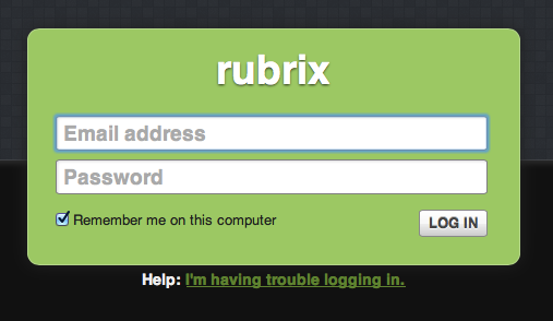
I've also simplified the sign in form. Nothing revolutionary, but we've reduced the size and amount of noise significantly.
Learning is doing
This summer's design projects reinforced a number of principles for me:
- Process is bullshit. Method and practice, however, are crucial to execution and skill.
- Freeform thinking before structure. Sketching beats regimented tools for creativity.
- Make it real as soon as you know what it is. CSS/HTML designs look better than sliced or faked graphics, and you can get to testing usefulness sooner.
- The little tools and techniques matter. Icon fonts are awesome sauce. LINT, minification, and LESS improve quality by reducing duplication and effort.
- Small design steps are easier to finish well. Increment methodically. Build testing into your core habits, into your product.
- Simpler writing tools result in better writing, and writing really matters. Simpler tools are better. Simpler editors, markup, and hosting.
Hammering at the methodology and practicing each of the individual skills shows results quickly. I'm able to prototype a new set of features in a few days now, assuming functioning creative mojo. Iterating design with shorter design stints makes for more polish. Wax on, wax off, and all that.